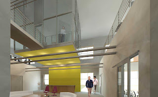
 Here is the second rendering done in Revit. The main differences you might see are that my file corrupted her chairs in her lobby, and I replaced them with a couple task chairs, just to have something there. Instead of the white space photoshopped renderings artistically bring in, the whole view is rendered. The shadows on white walls make it look more like a textured color than white, but the overall lighting qualities and shadows make it look more realistic.
Saturday, December 19, 2009
Revit Lobby Rendering
 Here is the second rendering done in Revit. The main differences you might see are that my file corrupted her chairs in her lobby, and I replaced them with a couple task chairs, just to have something there. Instead of the white space photoshopped renderings artistically bring in, the whole view is rendered. The shadows on white walls make it look more like a textured color than white, but the overall lighting qualities and shadows make it look more realistic.
Friday, December 18, 2009
Rendering Ashley's File In Revit
FINAL
We decided to research and plan a study to compare rendering with Revit rendering options as opposed to rendering a Revit wire frame with Photoshop. We wanted to compare materiality, lighting, and the overall graphic quality of the two different styles.
We predicted that using only Revit would produce photorealistic renderings with more attention to detail. They would also have accurate lighting, reflection, and shadow. The materials used would also have the right transparency and accurate interactions with other materials in the space. As far as time efficiency goes, I believe that while it takes less time to set up a rendering by applying materials, lighting, and running a few region draft renderings, it takes longer for Revit to render it. In the past I have had a rendering take 14 hours. This of course is dependent on what materials are in the space, what the lighting is like, the size ad quality of the image you are creating, and the computer you are using.
We predicted that the Photoshop renderings would produce a more humanized style. There could be a smooth integration moving from the Revit wire frames to a Photoshop rendering that produces a hand drawing sketchy quality that sometimes is desired. Because of this, it can portray a concept well. and possibly better, than Revit can. The materiality can still be applied with Photoshop but it wouldn’t be as realistic, depending on the piece it is applied to.
Our research was mainly done online, with reference to blogs and Revit instructional sites. Also, some links from our classmate’s blogs were used. They talked about applying custom materials in Revit to using Photoshop to create a hand drawn look from Revit wire frames.
Personally, I have discovered that I enjoy a combination of the two the best. I enjoy letting Revit handle some materiality and all of the lighting, but I feel I have more control over doing other elements in Photoshop. I also like using Photoshop for things that would take a long time to create for Revit when I could just copy and paste it, and copy and distort a shadow in a Photoshop file in significantly less time. In Photoshop I can also bring out and bring more attention to certain aspects of the rendering. I believe this study was a great asset in helping me discover what I can do to create time efficient realistic renderings yet still add a personal touch to them.
Thursday, December 17, 2009
RESULTS
Going back to my original question of whether or not Revit is the best program for rendering or if Photoshop is better, my final answer is that neither is better. The best scenario is to combine the two so that they can work in harmony with one another. By using both, you can take the strengths of each to enhance your rendering experience. One of the greatest benefits of Photoshop other than its sketchy quality, is its ability to speed up the rendering process. It did not take me much time at all to re-create Kristen’s lobby in Photoshop. However, not every aspect of the image is rendered entirely. Some areas are left blank, and that’s okay because that is the style. On the other hand, Revit renderings take a large amount of time to produce and can be very tedious. However, if you export the rendering at a lower quality without every material specified and then enhance it in Photoshop, you may actually produce a stronger rendering in less time. The bottom line is that there are successes and downfalls of both Revit and Photoshop, but it is the unique combination of using both that produces truly beautiful renderings that bring out the best qualities of both programs.
RESEARCH
Through researching several tutorials on both Revit City and Revit Kid and also research on AutoDesk, I was able to gain a greater understanding into the method of combining Revit and Photoshop. These tutorials and research proved that it is possible to use both programs in harmony with one another. If the sketchy look is so coveted as well as the honest look, then combine them to have both. Revit City provided a great example as to taking a Revit produced model and putting it into Photoshop to replace some of the color and give definition to the edges to make it look drawn. The outcome is an honest, pure drawing that looks like it may have been done by hand.
OUTCOME
The final outcome of my rendering is a much sketchier, hand-touched version of what I started with. The question is, does that make it better? I feel as though that is up to the individual, and everyone will have a different opinion. Some clients might prefer the more photorealistic, hard appearance of Revit, while others might want the renderings to look more hand-crafted. It also depends on what the designer feels comfortable with.
In this case, the final outcome of our test was that we ended up with two very different versions of our lobby spaces. There is a clear difference between rendering in Photoshop versus rendering in Revit. Revit produces photorealistic and honest drawings. Photoshop produces drawings that are sketchy, stylized, and leave a lot of detail left up to the imagination.
METHOD
By switching Revit files, we have both been given the unique opportunity to create a new rendering of each other’s project in our own style. The challenge has certainly been to match design intentions, such as using the correct materials and surfaces. Communication has been key throughout this entire process to ensure that we are both staying true to our original design intentions. In the end, we only want to test the final outcome of the renderings as far as how successful they are at conveying the design, not the design itself. The specific method I have chosen to follow is to export Kristen’s lobby view as a jpeg and pull it into Photoshop. Then I added the people that she had originally placed. Next I started drawing lines over the entire drawing to give it a sketchy feel. I then continued with the rendering process of adding color to walls, filters to people and materials, texture to furniture, lights, shadows, etc.
Thursday, December 10, 2009
Phase 3 Progress
Phase 2 Progress
Phase 1 Progress
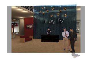 After increasing the canvas size, I am able to decrease the images opacity in order to draw lines over the image. These lines give the rendering a feeling of being hand-drawn. Next, I add filters to the people and lights to give it a more sketchy feel.
 Wednesday, December 9, 2009
Revit Kid example
Saturday, August 15, 2009
Revit Classroom Workflow - Step 6
Presentation
Tuesday, December 8, 2009
The Photoshop Process
Switching Files
Friday, December 4, 2009
Adjusting sunlight in revit rendering
To solve this I found a Revit tutorial that focuses on rendering only with sunlight. Once you can get a handle on this, then you can work with the lights you have in your space to create realistic lighting.
Here is the tutorial:
http://www.screencast.com/users/TheRevitKid/folders/Video%20Tutorials/media/b613c041-b151-49a6-a2c9-dd497b2620f9
I really enjoy the RevitKid. His tutorials seem to be geared towards students of Revit who need step by step coaching.
Thursday, December 3, 2009
Photoshop Tutorial
Rendering 2
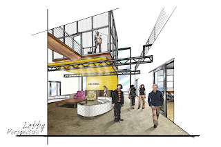 This is Ashley's original rendering. The perspective and all 3D forms were generated from Revit and then exported into photoshop. The rendering is a combination of hand and photoshop. All lighting and materiality were done in photoshop. I will replicate this process with my next rendering and log my successes and downfalls as well as the rendering time required.
Monday, November 30, 2009
Rendering 1
Expectations
- Photorealistic
- Attention to detail
- More time efficient
- Accurate Lighting Quality
Photshop:
- Humanized style
- Smooth intergration between programs
- Hand/sketch quality
- Portrays concept well
Timeline
We will search for current examples of these styles and any articles relating to our study.
December 5th- 8th: Prepare Renderings
We will switch project files, and begin rendering. We will keep track of our time through each step of the process and collaborate on material choices and other design decisions.
December 9th: Presentation
On this day we will be presenting our studio projects at 1 pm in the Cage. We will also have this project's renderings displayed along with our research and final outcome.
December 11th: Results
We will post the pros and cons for each style.
Detailed Plan
Friday, November 20, 2009
Objective
By combining this with our current studio project of an interior design office, Kristen and I will explore Revit’s rendering capabilities. With a 3D model complete, how can Revit successfully complete a project? One venue that we will discover is through the development of construction documents. Our second focus will be on the diverse options that Revit offers through rendering. While Kristen will produce renderings in Revit, I will focus on exporting Revit models into photoshop in an attempt to humanize the drawings. In the end, we will discover the successes and downfalls of each avenue.


